05
Nov
Composition Tips for Wildlife Photography – Part I
- By Gaurav Mittal
- No Comments
In this three-part article, I offer some fundamental tips to help you create compelling images. A composition is a key element of the image making process, a good composition results in visually pleasing images.
As a moderator for a popular online forum for bird photography at a wildlife photography portal, I critique and give composition-related tips to help photographers improve their images. Composition is at the core of developing standout images that simultaneously convey the photographer’s vision and his or her understanding of the subject. What we choose to include in our composition helps express the story positively or negatively.
In this three-part article, I offer some fundamental tips to help you create compelling images. Keep in mind that these tips provide a framework to create visually pleasing images and stimulate creativity; it is always good to think outside the box, deviate from established techniques, and develop your own shooting style.
Avoid Putting The Subject In The Center Of The Frame
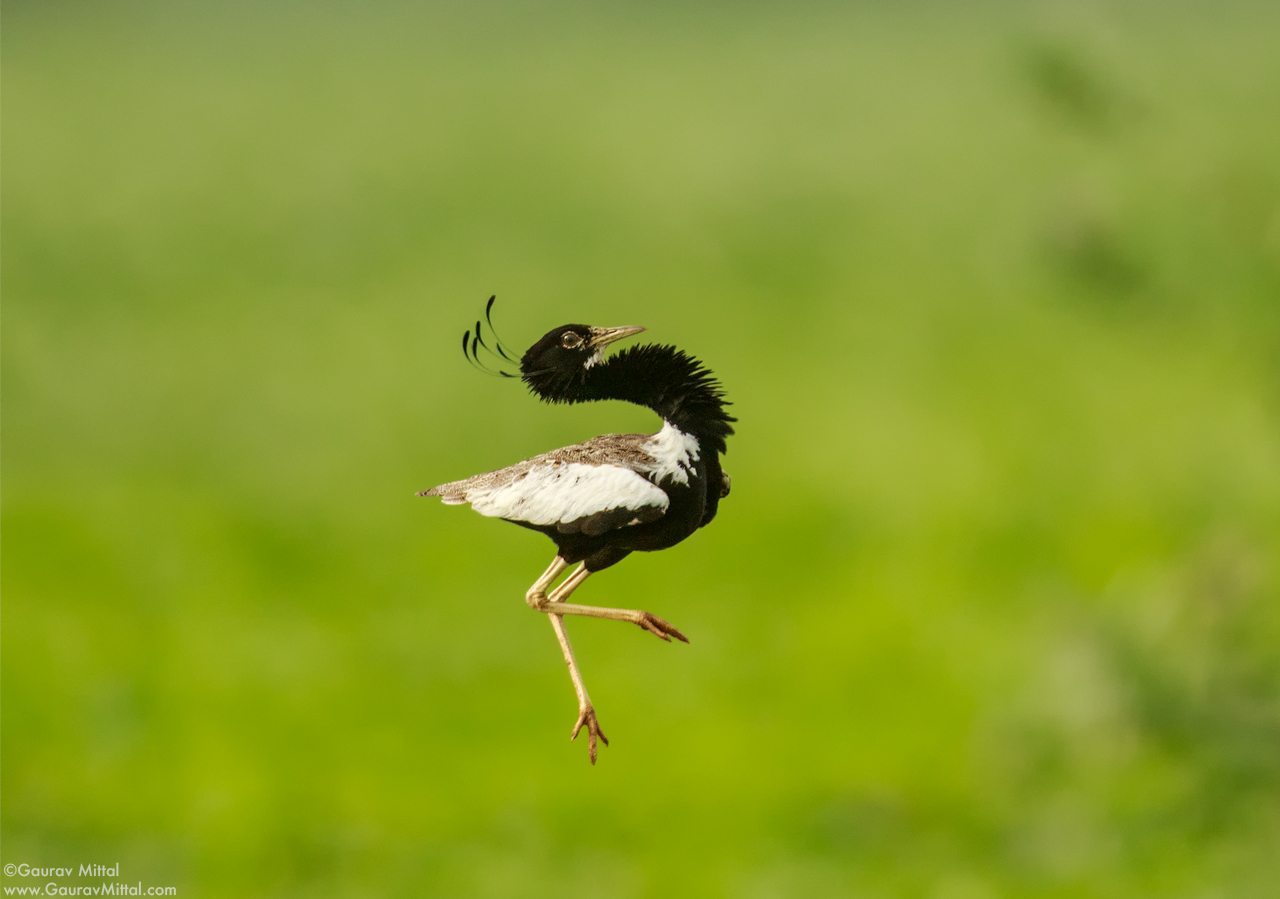
This is the most common mistake made by novice photographers. A centered subject with equal space on each side looks lost. Furthermore, it draws attention away from the subject and toward the surrounding dead space. This technique leaves the viewer wondering what the photographer wanted to convey.
Use The Rule of Thirds Composition Technique
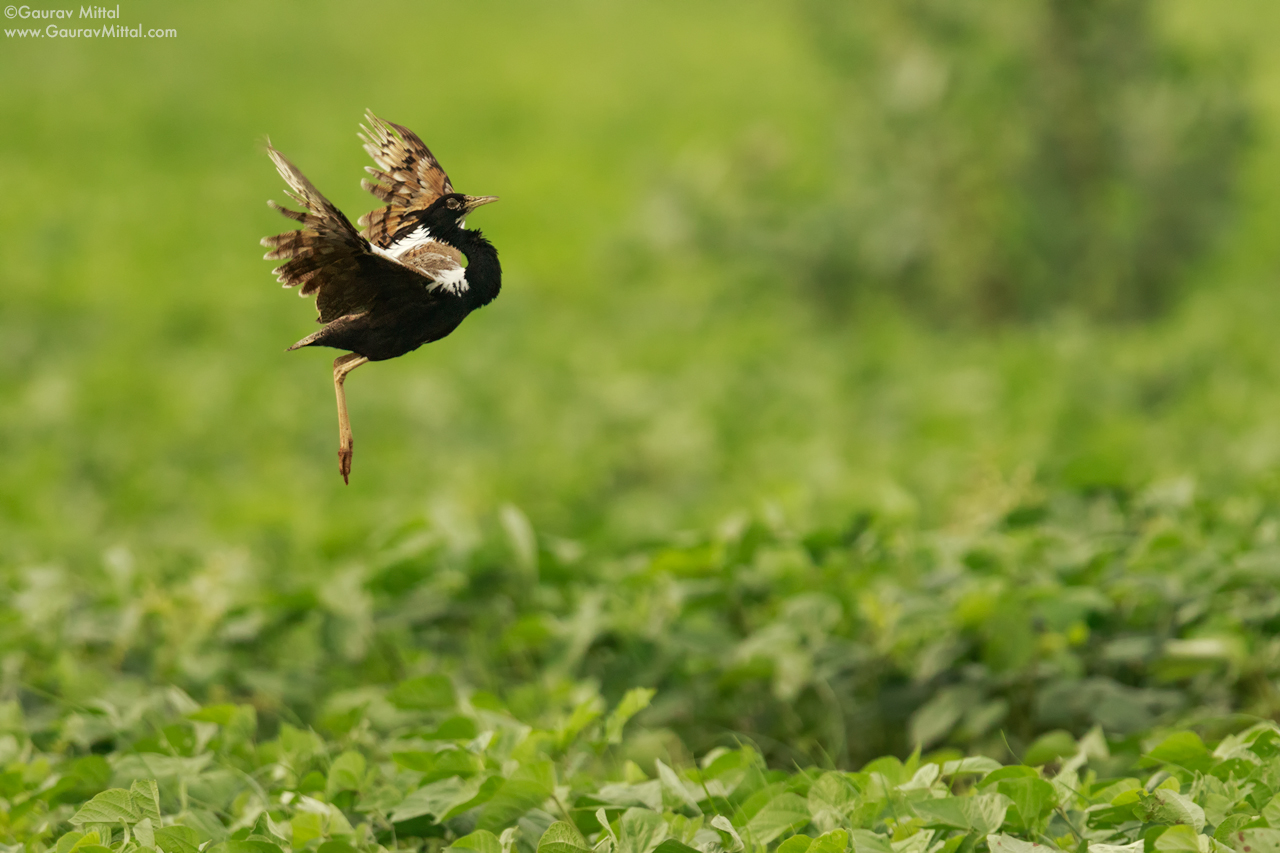
This is the most widely used composition technique across all genres of photography and every photographer learns it. The basic premise is to separate the image into thirds, both horizontally and vertically, and place the subject on the four intersecting lines. This technique can be applied to birds or other wildlife situations.
The Rule of Thirds forces conscious decisions about which elements remain in the composition and which are left out. Moreover, the rule facilitates creativity. For example, in the image above, I was able to include the bird’s ground habitat by placing the bird on the top left intersecting lines and I was able to tell the story of its unique leaping display during mating season.
Avoid Tight Composition
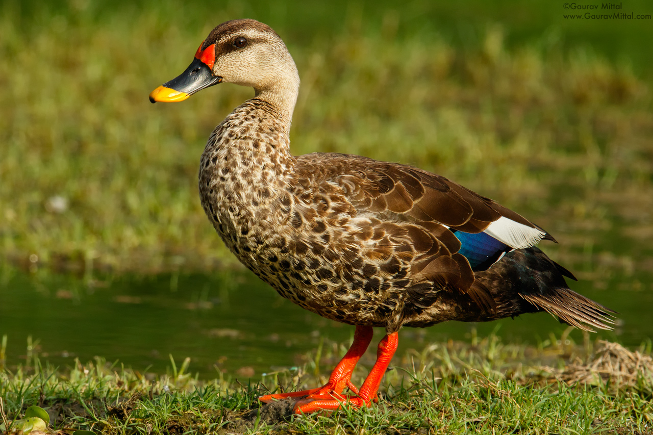
Another common mistake is related to tightly-framed or cropped images. This makes the subject appear suffocated or cramped, as in the image above. Ideally, you should leave more space in the direction the subject is looking, walking, or flying. In so doing, you let the audience imagine the subject’s action or behavior which allows for a connection with the subject.
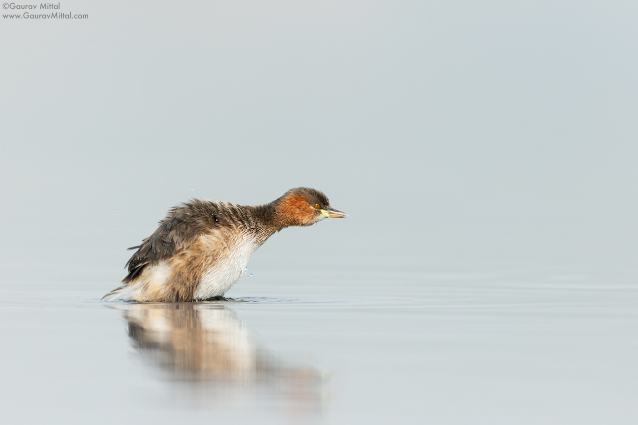
In the image above, I left more space to the right to give the bird more space for its dive. This leaves the viewer to visualize the action in the empty space.
To be continued… Composition Tips for Wildlife Photography – Part II


Submit a Comment